It’s not what you say, but how you say it.
While that usually refers to tone of voice, today it is referring to typography.
Typography is essentially the way the text is arranged. Not only will your words say a lot with their literal message, but they can also convey something on their own with their look.
Typography does not refer to just the font, text size and color, but so much more.
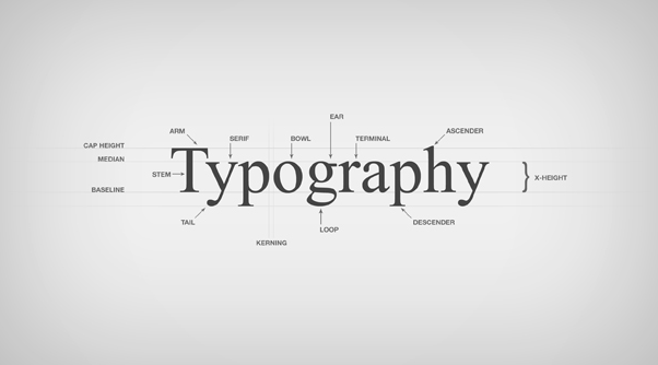
Here’s a basic outline on the elements of typography.
Typeface: This is probably one of the most basic elements of typography. The typeface is just the text style that is used, like Arial or Noteworthy.
Font: Font is not the same as typeface. Font refers not only to the style of the text as well as also the size of it. Font usually includes the typeface, the size as well as any modifiers like bold or italicized.
Tracking: Tracking is the letter spacing, and can be changed to affect text density.
Kerning: Not to be confused with tracking, kerning refers specifically to the white space between letters.
Line length: Line length is the length of text running horizontally across the page, and can be changed by adjusting margins.
Leading: Leading measures the distance between one line of text and the lines directly above and below it.
Many of these elements aren’t thought of when using standard word processors, but in design, all of these elements can be changed for a desired effect. While typeface and font are the main focuses of typography, playing around with elements like leading and kerning could lead to interesting results that could completely change your message.

